Also by this author: The Promise, The Drummer Boy, Sinner, Green, The Dream Traveler's Quest, Into the Book of Light, The Curse of Shadownman, The Garden and the Serpent, The Final Judgment, Millie Maven and the Bronze Medallion
Published by Thomas Nelson on December 29, 2009
Genres: Fiction, Christian, Graphic Novel
Buy on Amazon
Goodreads

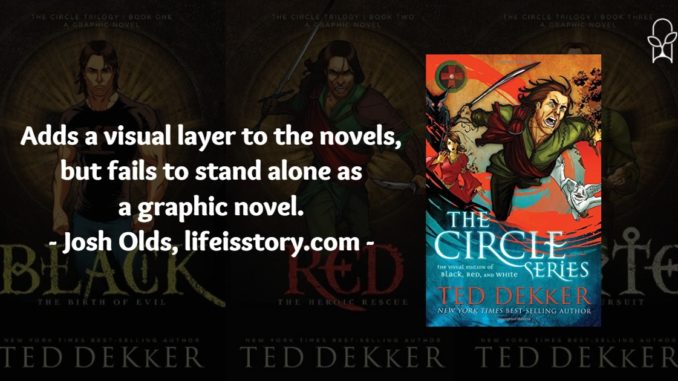
More than a million fans have read The Circle Series. Now dive deeper and see it in a whole new light--introducing the visual edition of the epic novels Black, Red, and White.
Thomas Hunter is a failed writer selling coffee at the Java Hut in Denver. Leaving work, he suddenly finds himself pursued by assailants through desert alleyways. Then a silent bullet clips his head . . . and his world goes black.
From the blackness comes an amazing reality of another world where everything is somehow more real--and dangerous--than on Earth. In one world, he's a battle-scarred general commanding an army of primitive warriors. In the other, he's racing to outwit sadistic terrorists intent on creating global chaos through an unstoppable virus. Every time he falls asleep in one world, he awakens in the other. Yet in both, catastrophic disaster awaits him . . . may even be caused by him.
Enter the Circle--an adrenaline-laced epic where dreams and reality collide. Where two worlds are on the brink of destruction with one unthinkable solution.
2007 was a big year for Other Earth. It’s three years after Ted Dekker’s breakout Circle Trilogy—about a million copies sold—and he’s just about to release the first two in what will eventually become a six-book young adult series that expands the Circle mythos. It only made sense, then, to ride the Other Earth wave into new kinds of media with a graphic novel series.
The Circle Trilogy: Visual Edition was first published in three separate volumes in October 2007, then combined into an omnibus version in December 2009. While the omnibus has the perk of being a hardcover and being one book rather than three, it’s also smaller in size. The originals were printed on large 6.5”x10.25” panels while the omnibus has a smaller 5.5”x8.5”. For general readability, I like the originals better.
I shouldn’t need to say much about the story, but if you aren’t familiar with the novels these comics were adapted from, then check out my reviews here—Black, Red, White. In graphic novel form, there are things that have to go. Each 400+ page book gets trimmed into a 130-page graphic novel. That’s a lot of trimming. Different people on Dekker’s team took on different roles throughout the process. Here are some of the major players:
- Black: Adapted by Bob Strachan and Matthew Hansen; edited by Kevin Kaiser; art by Big Jack Studios.
- Red: Adapted by Matthew Hansen; edited by Kevin Kaiser and Bob Strachan; art by Jack Studios.
- White: Adapted by J.S. Earls and Mike S. Miller; edited by Mike S. Miller and Kevin Kaiser; art by Mike S. Miller.
Some things that you’ll notice immediately just from this list: White has a significantly different team than either Black or Red. I have no details on what predicated that change, but it was a good one. It’s super evident reading the omnibus version that the artistic vision of White is much different—and much better. Looking at the first two volumes, there’s a lot of odd angles and character poses. Body proportions are sometimes, well, comical. The colorists are pretty jarring as well, using some very sharp shading that creates a harsh tone. The characters seem to be always in motion and always hyper-dramatically frustrated. This seems to the doing of lead Big Jack artist, Ig Barros. Notably, while the rest of the Big Jack team worked on the later adaptation of the Lost Books, Barros did not—and a quick look at his other work confirms a long of angular poses with constipated-looking faces.
In White, Mike S. Miller takes over. Mike had previously done work on graphic novels from material written by George R.R. Martin and Robert Jordan and worked for both Marvel and DC. Miller takes a much softer tone, making the characters more lifelike, particularly in facial details. Having one artist—someone also involved in the adaptation and editing—seems to have made for a much better product.
In terms of story, Matthew Hansen—current Editor in Chief of Marvel Comics/Dabel Brothers Productions—handled some adaptation duties, before handing over the reigns to J.S. Earls, while Kevin Kaiser handled editing duties. It’s always difficult translating a full-length novel into a relatively short graphic novel and a lot of character depth is missing. To Kaiser’s credit, every major plot point and every major character make an appearance in the graphic novel. There seems to have been an understanding that most readers would be coming from the novels and have a working knowledge of the story. The visual edition is here to add a visual layer to the story, not be its foundation.
Overall, I’d give Black and Red a 2.5 out of 5 and bump White up to a 4. The art of the first two volumes is just really distracting and the visuals are the whole reason why this version exists. White understands that a bit better, but has the weakest storyline of the three books.
